Goldbelly hired Rob because he had built Brainbase's design system and led the team doing that work. At Brainbase, the shared component library shipped as an internal package, with Storybook for documentation and testing. He also refined the path from Figma designs to components.
At Goldbelly, his own team had no design system. Rob built its Tailwind and Storybook system as an individual contributor while helping move merchant tools to a new frontend. Later, on a part-time contract at Genius Sports, he architected a Storybook system using Tailwind and Radix.
The library and the product have both been his responsibility.
His founder work connects those shared decisions to a product's identity. At Clear Labs, the company he co-founded, Rob owns the brand and product interface as well as their implementation. He designed the visual language and reusable UI system, then carried that system into ClearCPU, a Solana protocol designed for AI agent and compute payments.
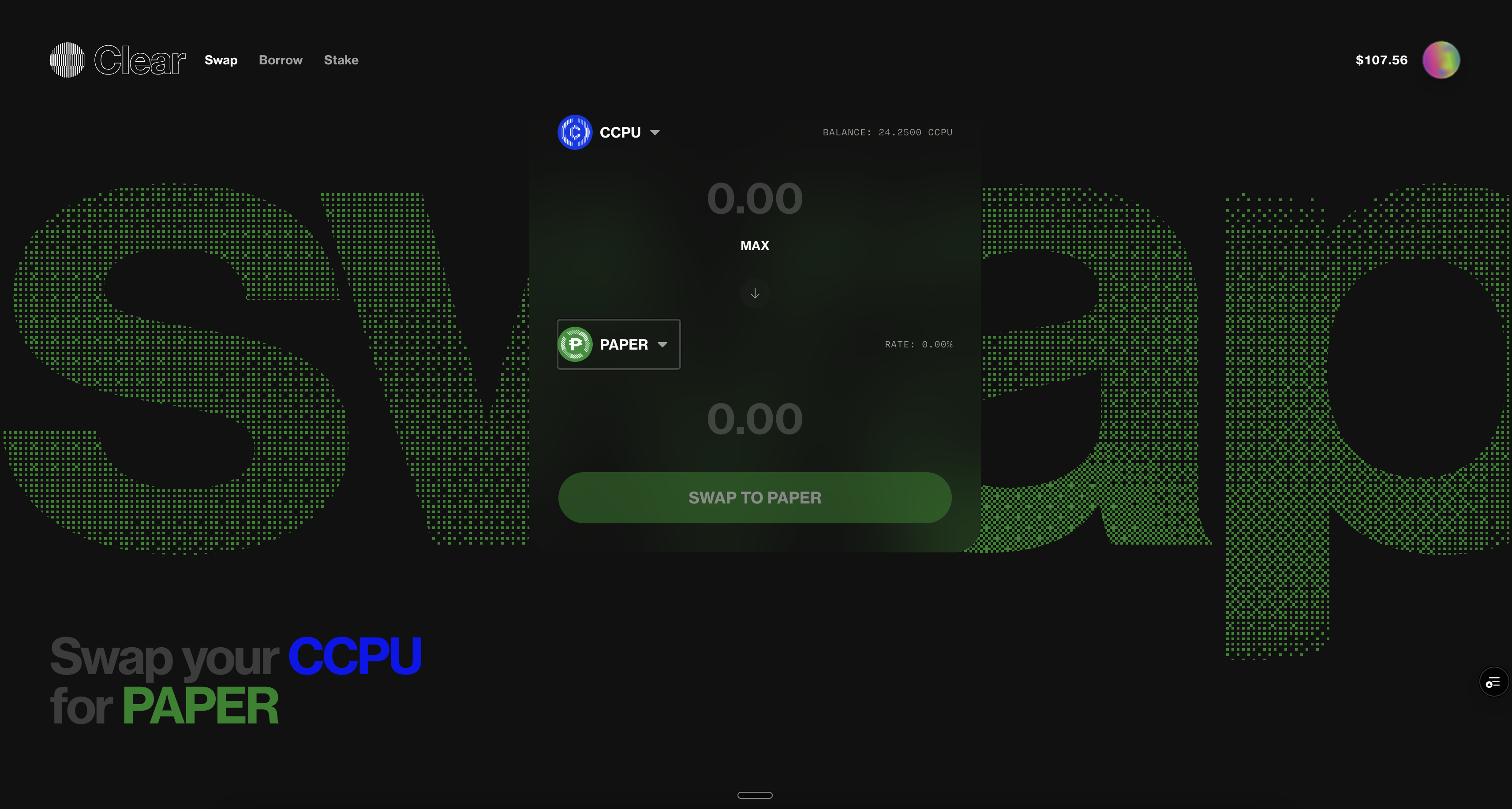
The historical swap screen below puts shared controls inside a distinct composition. The form imports the shared Button. Its oversized animated background belongs to a separate hero component. Repeated controls can stay consistent while the product keeps its own visual identity.
Shared components also need rules for the people and agents using them. Coding agents were adding inconsistent UI values at Clear Labs. Rob built Lens, a separate StyleX design system, with named design tokens exposed through typed component props. Box and Text reject off-scale spacing and color choices during type checking. Custom lint rules check usage in CI.
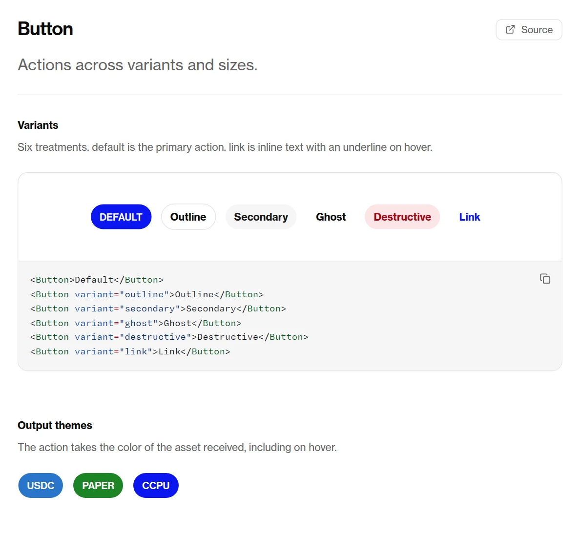
The Button reference below puts variants beside the code that selects them. The documentation extracts props from the actual types and includes working examples and source links. A builder can inspect an accepted choice and see its result in the same place.
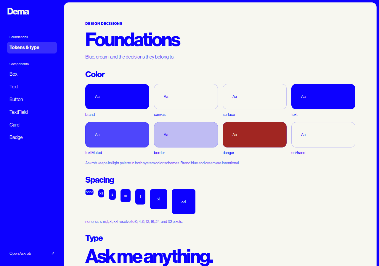
Rob applies that thinking in his own portfolio through Dema, the component library behind Askrob. Its foundations define named colors, spacing, and type. The site and conversation read those tokens. The chat's refresh control uses Dema's Button. The animated question pills keep their own implementation while using the shared colors and fonts.
The reference renders the same library components the application imports, with prop tables and copyable code. Shared components restrict arbitrary styling, while feature layout and animation stay close to the feature. The system defines what stays consistent without prescribing every screen.
A library still needs to survive the production build. During Dema's migration, background and border shorthand styling lost its paint during compilation. A geometry check could confirm the layout while missing that the colors were gone.
Rob's response was to reject the shorthand forms that caused the failure and check rendered color as well as geometry in the production browser. Types catch unsupported component choices. Browser checks catch what actually reaches the screen.
How would Rob assess our system before deciding what to keep or rebuild?
Dema, the design system behind this site